


Businesses decisions revolve largely around data and the ability to use it. Generating and upholding good data hygiene is critical to ensuring these decisions are sound.
In this blog, learn how your company can improve data hygiene and turn data into an accurate and actionable story.
What Is Data Hygiene?
Data hygiene refers to the practices and policies companies engage in to keep data clean, or to improve it after it is delivered.
Companies often think of data hygiene as a treatment method to clean up data—also referred to as data scrubbing. Practices include removing duplicate records, spell checking content, or checking data fields against one another.
Verifying the accuracy of data is important before it goes public. However, much like physical hygiene, data hygiene is most efficient when it is proactive. For instance, washing hands and covering the mouth and nose when sneezing are preventive steps we take to stay healthy. In the same way, businesses should incorporate measures along the way to test and validate data periodically throughout its lifecycle.
Good data hygiene will help preserve the reliability and consistency of data. This is known as data integrity. A team effort to take preventive actions will limit the risk of making poor and costly decisions.
1. Data architecture
Data architects should build data through the right scope, scale, and requirements. This will help anticipate the introduction of errors, and facilitate data validation and maintenance.
2. Data entry
Data input needs to be quick and accurate, which requires vigilance to avoid compromising data integrity, meaning reliable and consistent data.
3. Maintenance
Proper data architecture and data entry simplify maintenance. Creating an audit trail is advised when working on data, and making edits. This system enables you to easily trace back errors that might be introduced in data when removing duplicates and updating records for instance.
4. Report building
Report architects must understand data to sustain its dependability and detect errors.
5. Report consumption and visualization
In this phase, sales, operations, or finance departments use data to produce visualization. They are the last point before data goes out in the world.
6. Presentation
Data is delivered, but it is still worth raising issues if you detect them.
How to Achieve Legible, Actionable, and Memorable Content in Data Visualization
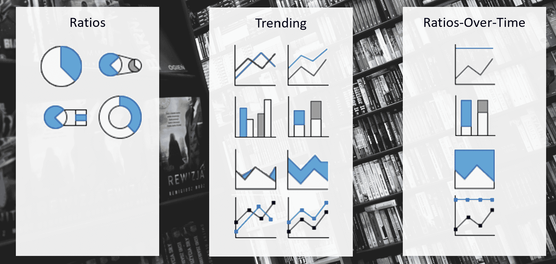
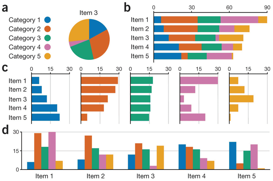
Once data is gathered, visualization is used to interpret it and build reports. In this phase, using different visualization options helps to challenge instincts and biases, and therefore test data. Pivot tables in Excel and software such as Tableau and Power BI exist to this purpose.
By exploring data with different visualization options, you can detect anomalies, and correct them, or simply collect valuable insights. Other ways of overcoming existing bias include trying to prove a conflicting point with your data or looking for ways to prove yourself wrong.
A data set is of no use if it is not legible. When building data visualizations, there are several elements you should consider to achieve memorable content:
Knowing and understanding the audience
Just like any content, your data should be adapted to the audience it is going to. You can do this by showing data in your audience’s local currency or preferred number formatting. Considering special needs and known preferences for data consumption can go a long way towards gaining their trust.
Viewing medium
When proceeding to visualization formatting, verify that it is legible on the output selected (large monitor, laptop, conference room screen, printout).
Level of detail needed
Find out what information is relevant to your audience and how detailed visualizations must be. If you’re unsure, opting for streamlined minimalist visualizations is always a good idea. You can also request proofreading from someone familiar with the subject.
The value of data is measured by the action or policy visualization drives. The audience should be able to take away concrete insights and concise explanations.
Here are a few red flags to look for:
- Inconsistent axis – for example unevenly spaced dates or currency values
- Comparing data sets with different sample sizes or collection methodologies
- Lack of transparency of the process – presenting a broader view of data with no context or explanation
Principles in Action: Readability
Legible, actionable and memorable traits should not only apply to visualization, but to all forms of content.
In technical communication, companies are interested in metrics on how customers consume their documentation. Findings around what pages are more and least visited, and resulting interpretations, will lead to actions such reorganizing topics to make them more useable or findable. Dynamic publishing systems, including Fluid Topics or Zoomin, offer analytics to support you in this process.
Responsive Web Help is another way to test your documentation content. You receive on-the-spot feedback from customers while they’re using the documentation. The support team can also assist in gathering useful metrics such as frequently asked questions (FAQs) or insights on product areas that create the most tickets. You can in turn respond by streamlining documentation in these areas, reducing tickets.
Readability metrics provide the framework to understand the complexity and digestibility of your content. Below are examples of readability metrics.
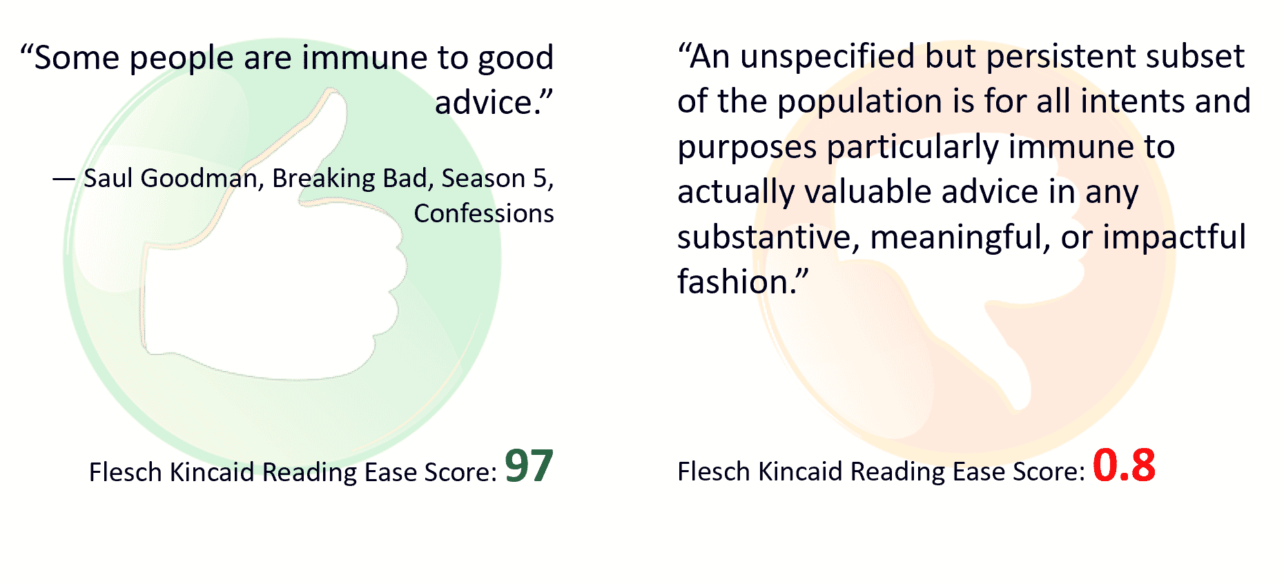
The Flesh Reading Ease
This metric indicates how difficult a text is to understand based on sentence length (average number of words), and word length (average number of syllables). A score is attributed from 0 to 100, and should be interpreted as follows:
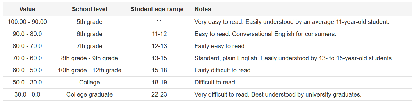
It supports the idea that content should be lucid and concise to make your text digestible and retain readers’ attention.
Websites such as reabilityformulas.com allow you to further test how content performs in readability. It compiles seven common readability measures to find a consensus, and calculates an average readability grade level, reading age, and text difficulty of the sample text tested.
Note that a significant but reasonable size dataset is preferable for obtaining meaningful visualizations. Good data hygiene and counterfactual testing are however important, regardless of the size of your data set.
With the results of the testing, you can move on to exploring visualizations and deciding which one is the most appropriate, legible, and actionable.
Good data, and more generally good content is legible, actionable, and memorable. Maintaining proactive data hygiene enables companies to confidently produce trustworthy and compelling data stories, hence facilitating the journey to sound business decisions birthed by a team effort.
This blog was originally presented as a IXIAtalks webinar by Matthew Neu, Analytics Guru. You can find the webinar here.
Learn more about our IXIAtalks webinar series.